This is just a little thing I made. Much like the beat ’em up demo below, it’s all written in standard JavaScript and uses the HTML5 Canvas for drawing.
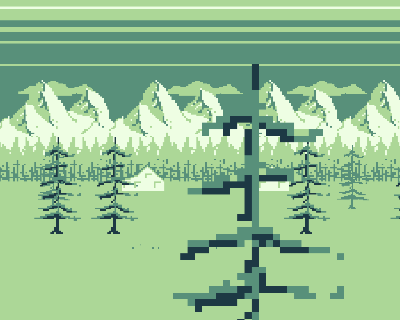
This is just a little thing I made. Much like the beat ’em up demo below, it’s all written in standard JavaScript and uses the HTML5 Canvas for drawing.
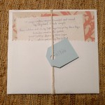
I ordered Elephant Parade‘s album ‘Home’ and got it in the mail recently. What a nice surprise to see a personalized name tag on the hand-made packaging:


This is the first in a series of posts of how I came up with the art and color scheme that I did for lil todo. I’m no expert at graphic design or product design, but I figured my little experiment with writing an app and trying to make it beautiful might help other developers out there. If you have any thoughts or suggestions, please post them in the comments below. Thanks for reading.
When I first decided to write a Windows Phone app, I really wasn’t too concerned with how it would look. I just knew it should work well, should be simple, and overall it should just get out of my way. After researching other to-do apps, though, I started noticing a lot of, shall we say, aesthetically challenged apps. That’s when I decided I should put a little bit extra effort into how the app looks just to stand out. Continue reading the art of lil todo, part 1