My Windows Phone App Download Stats After Two Years

Two years ago, around April 2011, I wrote a Windows Phone app called lil todo. How’s it doing today?

Before we get to the numbers, some context is useful. lil todo was written for fun and a bit of necessity. I had a Windows Phone and was curious to learn how to write an app for it. I also found there weren’t any good GTD-style to-do apps in the market for the platform, so I wrote my own.

It wasn’t written to make money (it’s free!), so I didn’t do any marketing. It’s been updated a couple of times to fix bugs or add minor features, but for the most part the app you download today is the same one released two years ago. In summary, it’s a neat little app that most people have never heard of, unless they do a search in the Marketplace for it.

LilTodoAmongstTheCompetition

With that out of the way, how popular is the app? Two weeks after release, the app was downloaded 218 times. One month after release, the app was downloaded 342 times. For the first few months, the average daily download was around 5-10. After a year, the downloads eventually plateaued to around 2-3 a day. After one year in the market, the app was downloaded about 1400 times.

Let’s skip ahead to two years. Here’s what we see today:

Screen Shot 2013-05-23 at 8.03.06 AM

There are a lot of interesting things going on in this graph:

  • Today, the app has been downloaded over 5800 times.
  • The cumulative downloads slope is getting steeper. Today the app is downloaded roughly 10 times a day.
  • Each change in slope is preceded by a spike in daily downloads. I suspect these are when either a new phone is released or the platform is made available to new markets.
  • There was a huge spike in downloads in February, 2013. What the heck happened then? (A major new market was added? Bad data?)
  • Not on the graph: Total number of reviews for the US market is 19. That’s pretty low in comparison to a lot of other, more popular to-do apps.
  • Not on the graph: Total US downloads: 1500. Total India downloads: 1400. That means about half the downloads are coming from the US and Indian markets. The next biggest downloads are from Germany, Colombia, Chile, and Finland (around 300, 260, 230, and 230, respectively).

So there you have it. Even an app that was never localized to non-English locales and is barely updated is still getting downloads.

If I redesigned the Zune client

The Zune software client always looked off to me. Something just wasn’t right about it, but I never really thought about why.

Well, today, I looked a little closer and with an amateur graphic designer‘s eye, I noticed the main problem is just that things don’t line up; margins aren’t consistent and neither is spacing. The net effect of this is that it looks cluttered and disorganized.

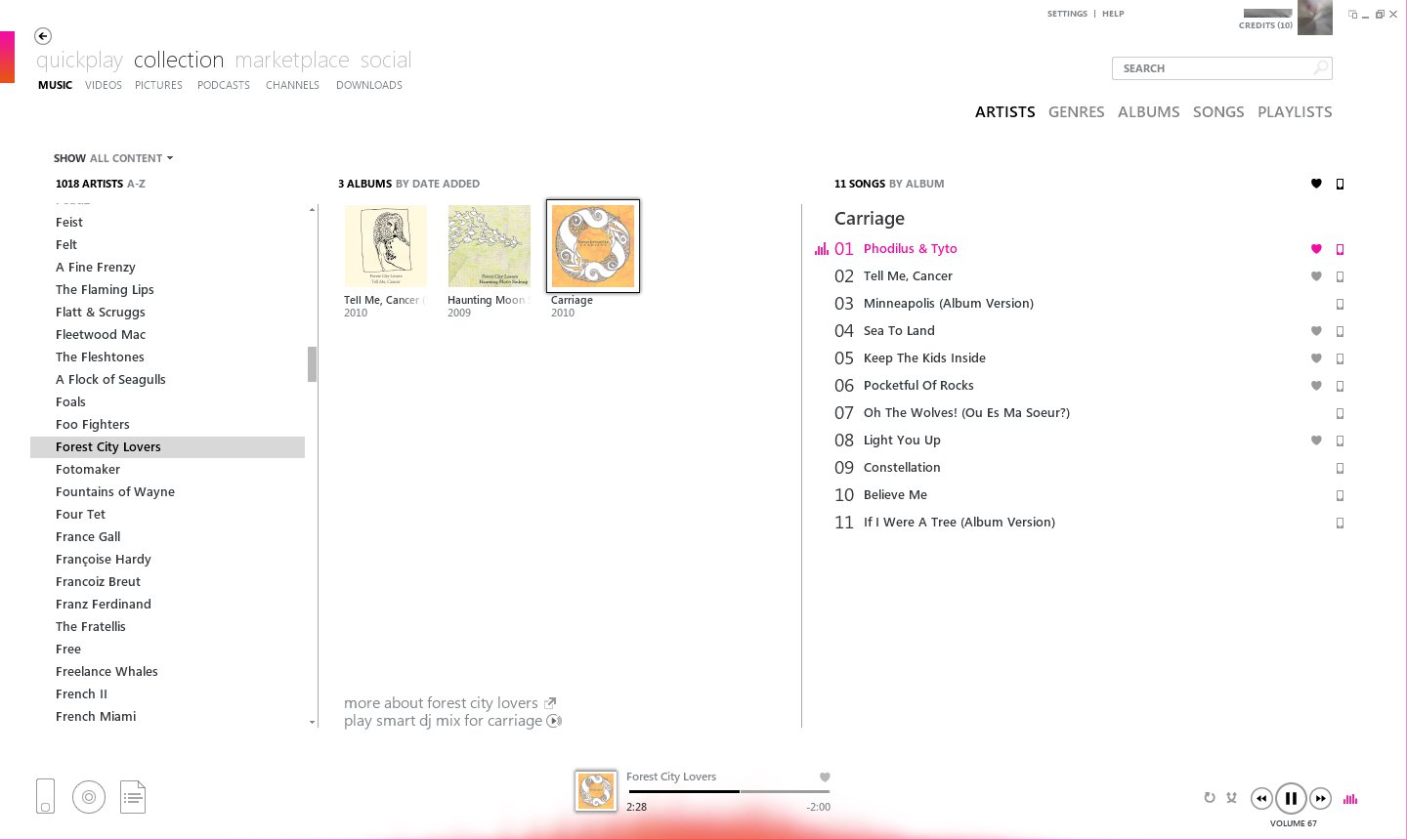
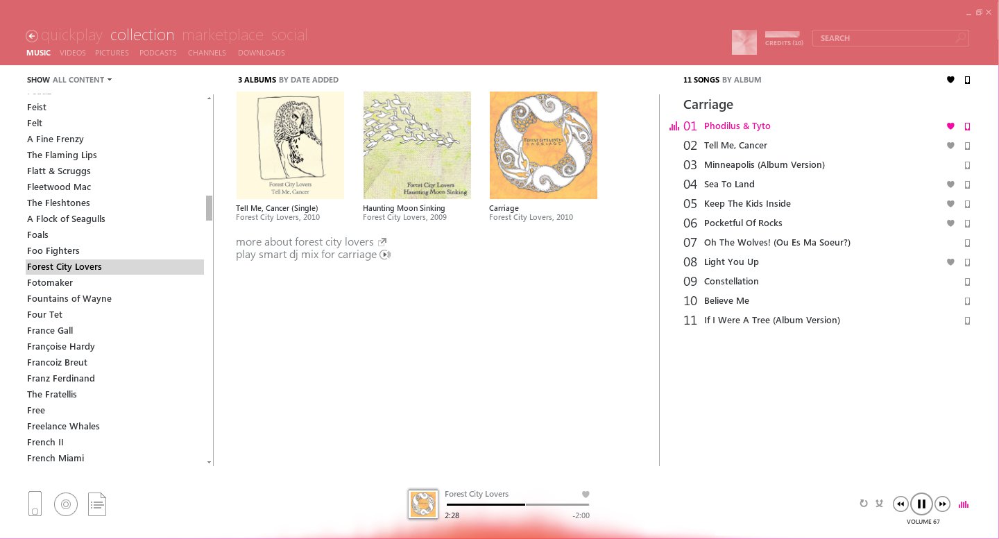
Here are some screenshots to illustrate my point. First off, here’s what the software looks like in full screen mode. (Click to embiggen.)

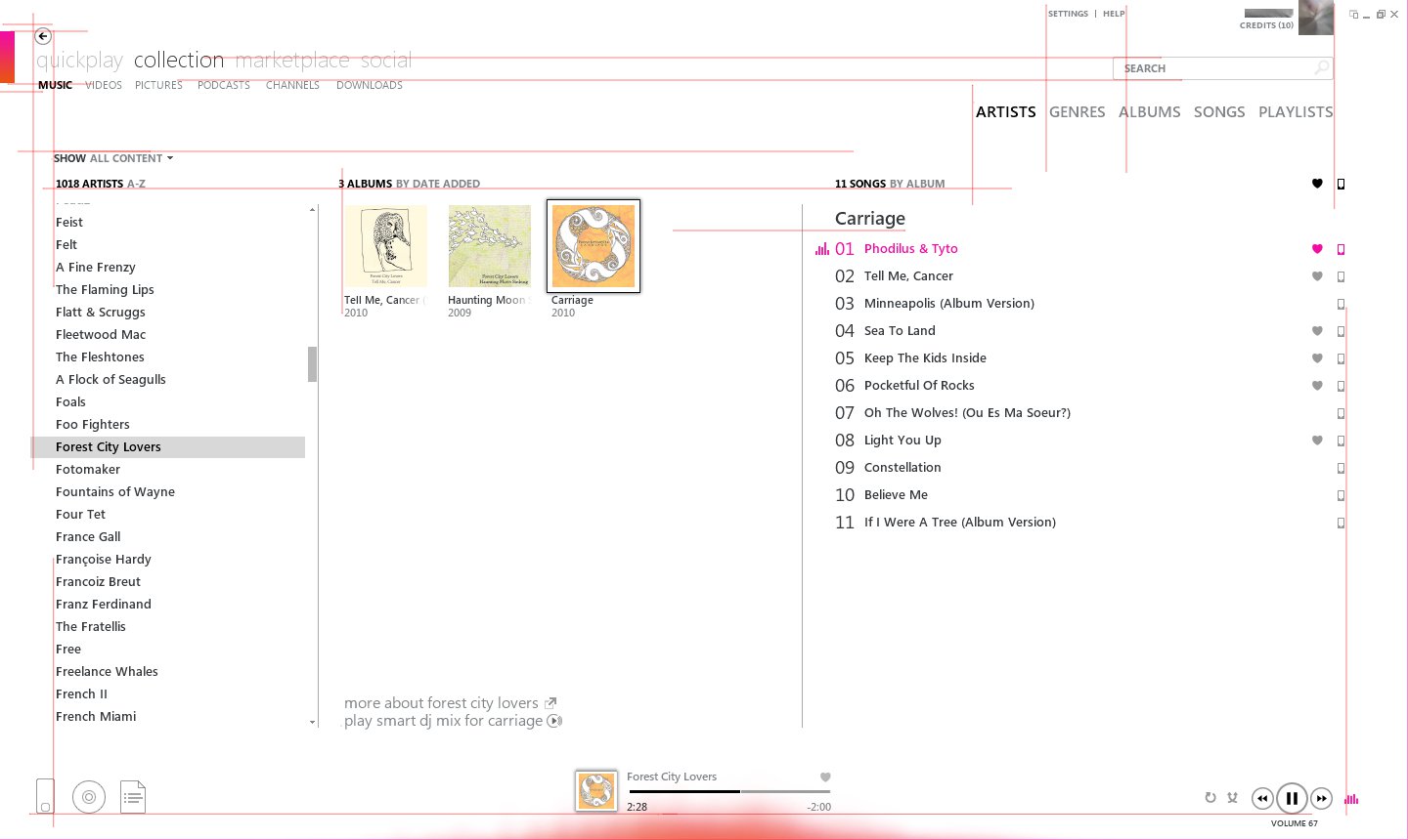
Even if you don’t enlarge the image, you can immediately notice that things along the left-hand margin don’t line up. Things along the right-hand margin don’t line up either. Here’s a marked up version of the above to show you what I mean. (Bigger view here.)

If you look at the lines above, you see there isn’t a whole lot of consistency. It looks like they were trying to go for a grid layout, but failed to line things up correctly. (Also, now that you’ve seen the inconsistent margins, you cannot unsee it. For that, I apologize.)

It gets worse when you resize. (Click for bigger image.)

When the window is resized, you can start to see why some of the layout decisions were made. The reason “ARTISTS GENRES ALBUMS…” is on its own line and right-aligned is that when you re-size, it has to have room along the left to move. (That doesn’t excuse some of the design decisions, of course.) The search field eating away at the “quickplay collection marketplace…” text is particularly ugly.

Just for kicks, I decided to spend an hour to line things up to see if I could improve the visual clutter. I dropped some features along the way to make it work; see if you can spot them. I also took some liberties and copied the style of a great Metro-themed app, MetroTwit, and gave the header some color. Here’s the end result (again, click to make bigger):

What do you think? To me, the above already feels more solid. Things line up along the left, right, top, and bottom. I immediately feel a sense of trust in the software–and I didn’t even fix any bugs!

In my opinion, when things are organized correctly and given a proper layout, the content shines a lot more and you just trust the damn thing more. Your eyes and brain aren’t confused by what is being presented. You immediately see the connection between things because they are intentionally placed.

Coincidentally, I also made the album artwork bigger in the above re-design. There’s a funny feature in the Zune software: if you have a single album in the album artwork section in the middle, the artwork looks big as above. But as soon as there are two or more albums displayed, the software displays smaller artwork. I understand the reasoning behind this from a functional standpoint. You have lots of albums, so show as many as you can so that you can find the one you want.

However, form here is way more important here than function. The album artwork is the star of the show when you’re looking at your music collection. In this digital age, people no longer buy physical media and to really have a connection with the content, which is really just bits, you have to show the artwork surrounding it. Make the art front and center.

Anyway, after doing the above mock-up, I decided to see if anyone else has attempted to re-design the Zune software. It wasn’t long before I encountered some screenshots that looked really nice:

The above re-design really nails it. The margins line up and everything looks rock solid.

Funny thing is, the above isn’t a re-design at all. It’s the Zune software version 2.0. So what happened? As best I can tell, it’s a matter of feature creep without UI re-design. If you compare the 2.0 screenshot above with the latest version of the client (4.7), you can see the following changes:

  • LiveID account info added to top-right corner
  • Zune logo removed and replaced with a gradient rectangle
  • Back arrow moved above the header navigation text
  • Mini player button added to top-right corner, beside minimize, maximize, close icons

The account info and the mini player addition is what screwed up the right margins. The removal of the Zune logo is what screwed up most of the left margins. I’m unsure as to why the Zune device icon in the lower-left is out of alignment now, though. Perhaps they decided to line up those icons with the “quickplay collection marketplace…” header, but failed to line up the artist list.

In closing, what’s the lesson here? When you add new features to software, you’ve got to re-evaluate your UI to make sure it’s still consistent. It looks to me that the above was a result of varying teams adding new features and nobody really making sure that the overall experience was still correct. The other lesson is that good and bad design is all around us. Take a look at the software on your smart phone and ask yourself why it looks nice. You might find that it could simply be a matter of lining up the margins.

As always, I’d love to hear your comments below.

Some nice-lookin’ Windows Phone tiles

I’ve been collecting Windows Phone app tiles in the last month and here are my faves so far. This is a random sampling–other than my own that’s in there, of course. These are just apps that I came across and thought looked nice. In most cases, I’ve never even tried the app, so I can’t vouch for how good they are. But maybe this’ll entice you to download some of them. 😀

Scroll down for links to all apps.

App download stats after 14 days

I now have stats for lil todo, a WP7 app, for 14 days. lil todo got published to the Windows Phone Marketplace back on April 9th, and because of a 6-day delay to stats for the Marketplace, I have data for up to April 23.

The grand total after 14 days is 218 downloads, which is an average of 15.57 downloads a day. However, the trend looks pretty grim:

The graph you see above is the number of downloads per day from 4/9/2011 up to 4/23/2011.

It’s a pretty steady trend towards zero downloads a day. On the 23rd, there was only 1 download. Granted, I haven’t done much advertising of this app, so take what you will out of these numbers.

Some thoughts and random points:

  • there are about 100 to-do apps in the marketplace (there were maybe 15-20 when I first started developing mine), so there’s a lot to choose from
  • most people aren’t likely looking for to-do apps, but they are searching for games, I imagine
  • do most average people know about the marketplace at all and how to download apps?
  • this app is free and has no ads, so price isn’t holding people back from downloading it
  • the second peak you see at 4/18 occurs around the same time as I updated the app, so it’s possible it showed up in some sort of “updated apps” page (?)
  • the reason for the big debut was most likely the huge visibility of the app in the “new apps” page when browsing the marketplace
  • my app shows up on page 5 of the “Productivity” category in the Zune app. I assume you move up the pages with more downloads.
  • the app has around a 4.5 rating with 8 ratings. That means 8 out of 218 people rated it
  • I’m not sure the new, eye-catching app icon for the 4/18 update made a whole lot of difference
  • there were 19 downloads in Germany, 21 in the UK, and 127 in the US. All other countries are in the single-digits each.

At the end of the day, though, you have to admit, 218 people downloading an app is a pretty darn small amount. I should try writing a simple fart app as an experiment to see how many downloads I can get from that. 🙂

UPDATE: I checked the stats again and they have been updated. The 4/23 number is now 8 downloads and the following two days (not originally in the graph) are 9 downloads each. From this small sample, it looks like downloads may start to settle at around 8-9 a day.


Early marketplace download stats

My app, lil todo, has been in the marketplace for about 10 days now, since April 19, and I now have some numbers

For the first four days: 131 downloads. (The marketplace has a delay of something like 6 days for data, so I don’t have anything beyond 4/13.) These are early numbers, so let’s see if there’s a trend of some sort. Also, at this point there are 7 reviews of the app, and they are all 4 or 5 stars.

This app is totally free (no ads or fees) and a kind of experiment for me, so once I have more interesting data, I’ll share it.