This is the first in a series of posts of how I came up with the art and color scheme that I did for lil todo. I’m no expert at graphic design or product design, but I figured my little experiment with writing an app and trying to make it beautiful might help other developers out there. If you have any thoughts or suggestions, please post them in the comments below. Thanks for reading.
When I first decided to write a Windows Phone app, I really wasn’t too concerned with how it would look. I just knew it should work well, should be simple, and overall it should just get out of my way. After researching other to-do apps, though, I started noticing a lot of, shall we say, aesthetically challenged apps. That’s when I decided I should put a little bit extra effort into how the app looks just to stand out.
Above: Some sample Windows Phone 7 to-do app icons. I’m sure these are all excellent apps, but the tiles aren’t very pretty.
From the start, I wanted to go for a real-world theme. If you take a look at a lot of the nicer looking apps on the iPhone and iPad, for instance, they take a real world concept and idealize it in their imagery. Real-world objects in digital form can be just as desirable if designed right. Just take a look at these app icons and ask yourself if they don’t make the apps more desirable:
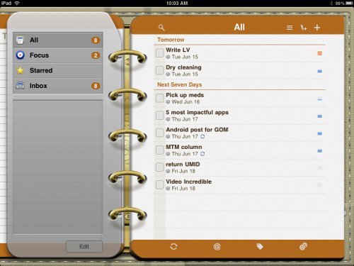
If you go further and take a look at the interfaces themselves, such as this one for Todo on the iPad, you see an extension of a real-world concept. In the example below, a to-do list is converted into a planner binder. This is a kind of skeuomorphism where the ornamentation doesn’t really add to the functionality of the app itself, but it does make the app look nice, don’t it?
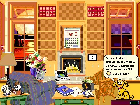
This doesn’t always work, though, as anyone who’s seen Microsoft Bob can attest:
The above is just too busy. You really can’t tell what’s clickable and what isn’t. The whole thing isn’t very inviting and just makes you want to run away. Granted, back in the day that MS Bob was released, we didn’t have the processing power or rich displays that we do today.
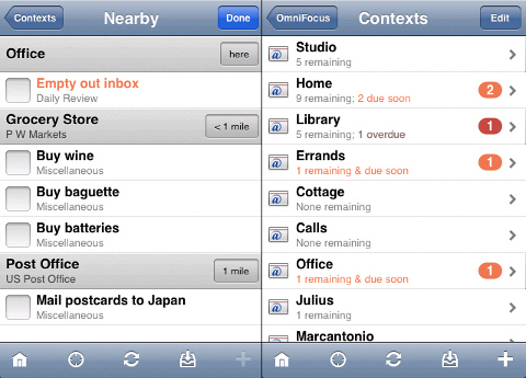
Of course, on a phone, you don’t have a huge canvas to work with like on the iPad or a computer monitor, so you have to keep it simple. You can’t really create a binder in the limited canvas that you do have. OmniFocus, an excellent GTD-style todo app on the iPhone, does a good job of keeping things simple but highly functional in a small space:
Getting back to desirable imagery, the trouble with to-do apps is that the only real-world object you think of when thinking of to-do lists is a scrap piece of paper with a checklist of tasks. Usually, these are scrawled messily with pen and when you’re done, you check them off or cross them out and then chuck that sheet of paper. You can’t really covet a scrap piece of paper like you do a Leica camera or a Moleskine notebook.
That got me thinking, well, let’s pretend we’ve got a notebook to store all of our to-dos. People like notebooks. I do. They’re personal; they feel good in your hands. The bound paper feels steady, constant. It’s reliable.
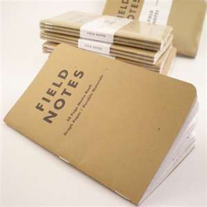
Perhaps in the real world, most people don’t use notebooks to keep track of their checklists, but there are beautiful little notebooks like Field Notes that can be used that way. Field Notes have a nice design that definitely makes them desirable. You want to just carry them with you, hold them, yank them out, and doodle in them. As they get worn, they start to develop their own story and character. They’re gush-worthy.
Moleskine notebooks are similarly gush-worthy. Certainly overkill for keeping simple checklists, but let’s remember we’re trying to come up with an idealized notion here. If you had lots of money, why not have fancy bound notebooks for keeping track of your daily to-do lists? It’s a status thing, right?
With this imagery and notion of a “notebook of checklists” in mind, I decided to go ahead and design the app with these visuals. In the next post, I’ll describe how I started to run with this idea and style my app around having notebooks of checklists. Stay tuned.
