Great post on logos designed by Saul Bass and how they look today after having been “updated”. Most of the newer logos just have more “chrome” to them which takes away from the simple, but elegant, original designs.
Category: Art & Design
Make your app tiles look more professional
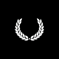
Looking at a lot of the app tiles for WP7, I see a lot of them can easily be improved with this simple tip. To make your app icon look more professional, be sure to add space around your icon’s border. Go from this:
To this:
The first version of the Roman Numerals app icon is just way too cramped. And really, the focus is the huge black space in the middle of the picture. The second version might seem small at first, but the negative space around the icon makes it feel more balanced. It presents the icon in a better fashion since it is correctly framed. Compared with the first, this version just feels more professional.
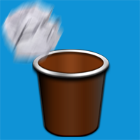
Here’s another example with Paper Toss before:
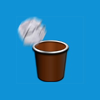
And after:
If you look at the built-in apps, like IE or Outlook, they make proper use of negative space around the icons. In general, liberal use of negative space conveys elegance and sophistication. If used properly, it can deliver the message that your app is professional and created with care.
See this great article for an even better explanation of negative space.
the art of lil todo, part 1
This is the first in a series of posts of how I came up with the art and color scheme that I did for lil todo. I’m no expert at graphic design or product design, but I figured my little experiment with writing an app and trying to make it beautiful might help other developers out there. If you have any thoughts or suggestions, please post them in the comments below. Thanks for reading.
When I first decided to write a Windows Phone app, I really wasn’t too concerned with how it would look. I just knew it should work well, should be simple, and overall it should just get out of my way. After researching other to-do apps, though, I started noticing a lot of, shall we say, aesthetically challenged apps. That’s when I decided I should put a little bit extra effort into how the app looks just to stand out. Continue reading the art of lil todo, part 1


