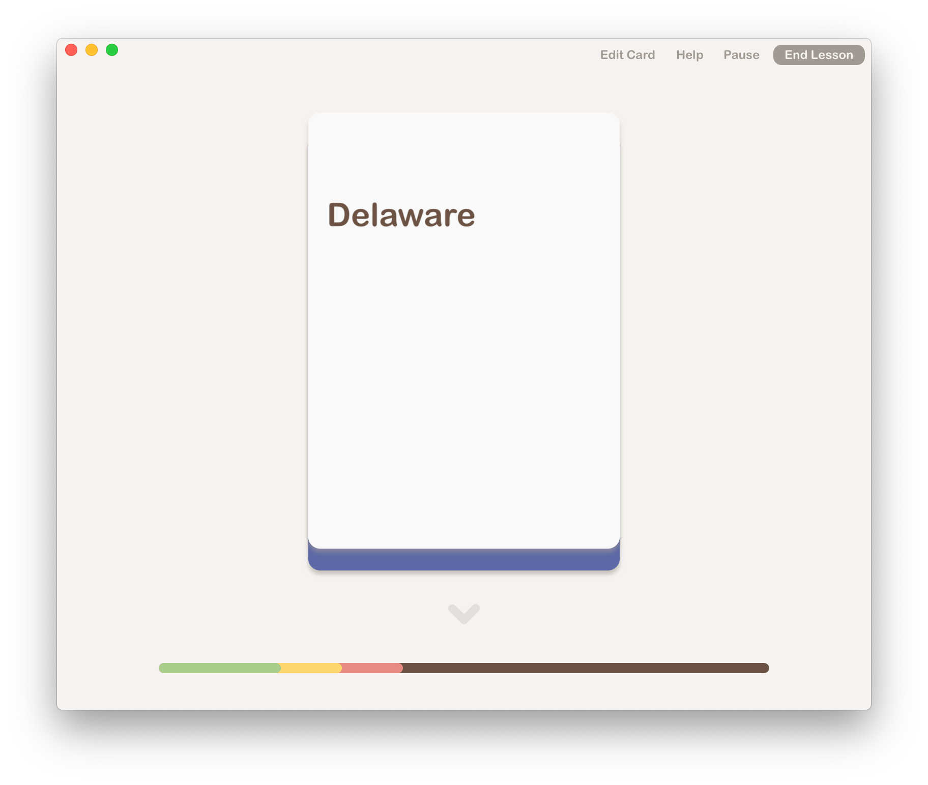
I’m going to start a series of posts about the User Experience (UX) design elements I’ve included in Fresh Cards, a new iOS and macOS flash card app I’m developing.
I’ve had a lot of fun thinking through the UX of the app in an attempt to make it as easy to use as possible. I want to share some of the little details I’ve included because I think they’re great and I’m quite proud of them. 😁 I think there are some key design principles that a flash card should employ to keep users coming back. As I’ve discussed previously, existing flash card apps don’t have quite such easy to use user experiences. After working on my app, I can see why. It’s a lot of work to think through each user interaction. Often, after you’ve implemented a solution, you find some things that need tweaking, so you go back to the drawing board and re-do it. This process of refining a user experience should not be new to UX designers, but for regular devs, it can be surprising.
Anyway, watch this space as I’ll be posting in the next few days and weeks about the UX in Fresh Cards.