Work continues on Fresh Cards! Fresh Cards is a new flash card app I’m developing for macOS and iOS.
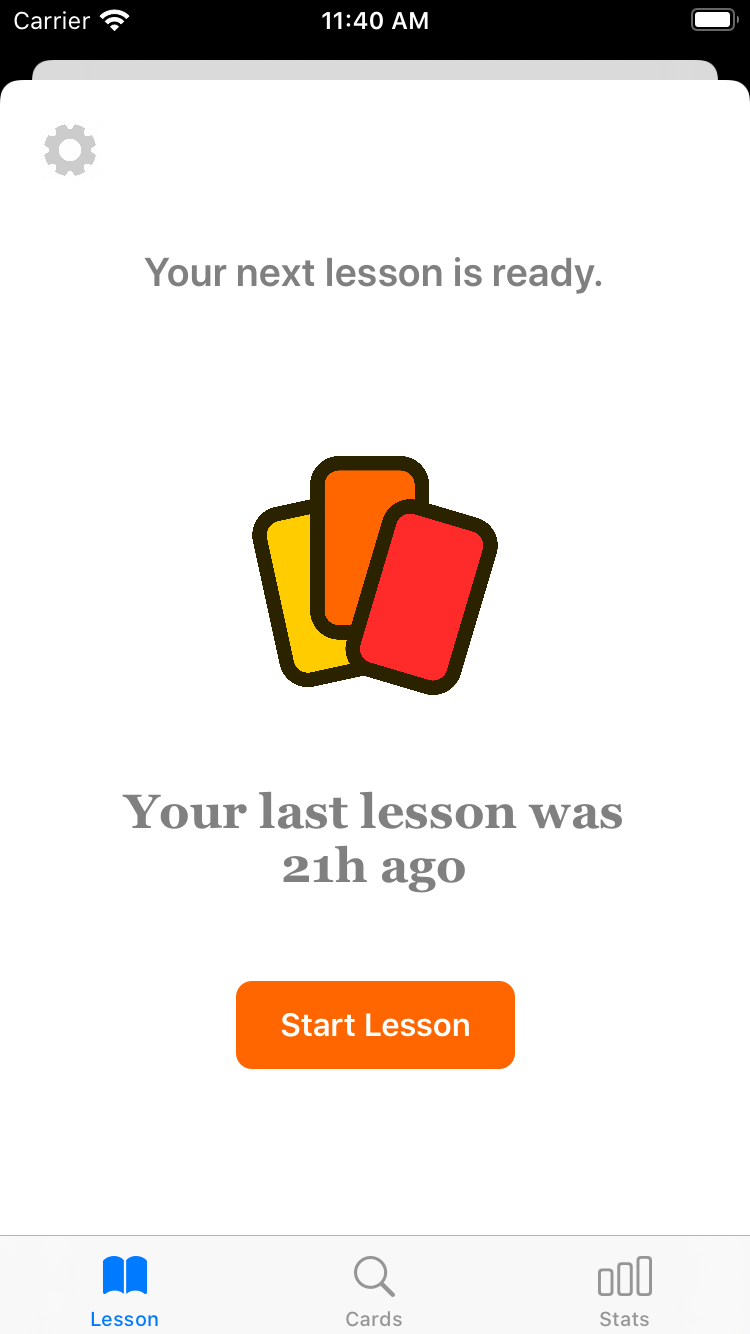
I’ve been refining the lesson UI, trying to make it easier and easier to use. At the moment, the app has three tabs per deck, one for the next lesson info, one for the list of cards, and one for the stats. After using this app for several weeks now, I’ve realized that I’m always switching between the lesson info and the stats screen. It dawned on me that it makes sense to combine them for a one-stop shop.
Here’s a sneak peek at a design mockup I put together last night in Inkscape:
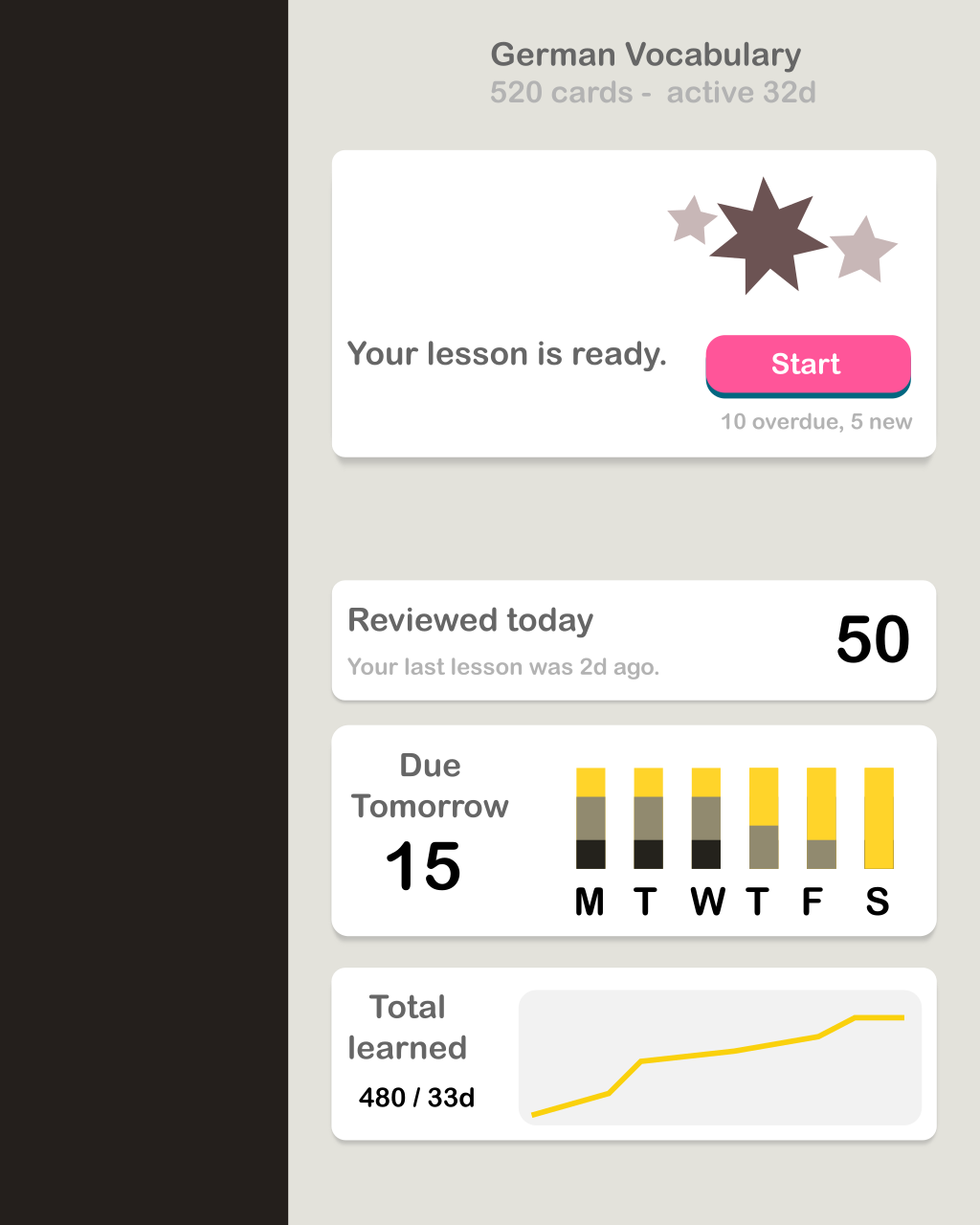
If you’re in the app to view a lesson, you’ll see it right away. However, if you’ve already done your lesson and just want to see info on your next lesson or other trends, you’ll see them right away too.
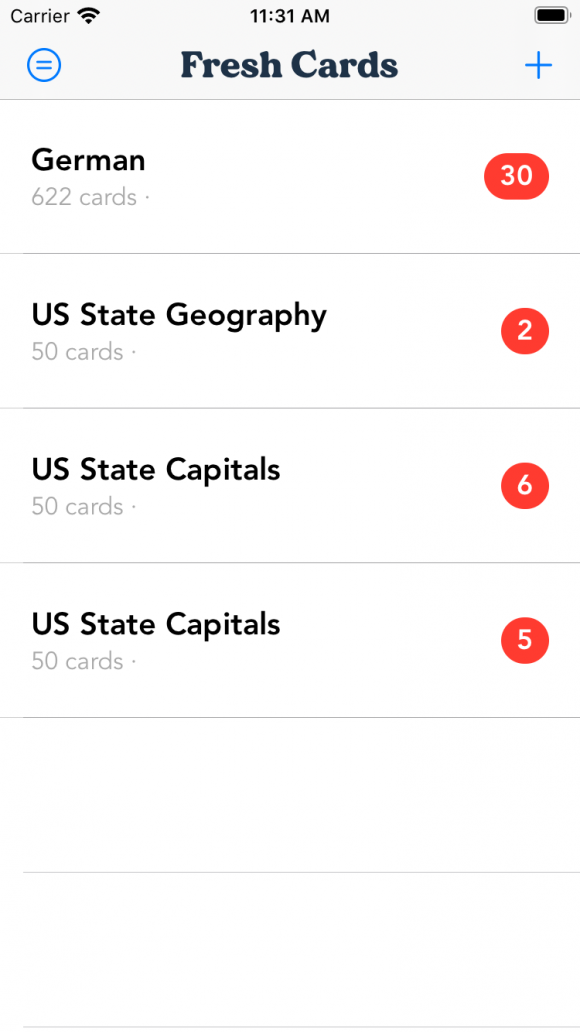
Simultaneously (yes, I’m doing all of these tasks at the same time), I’m getting the iPhone version of the app up and running. There’s a lot of shared code, so the majority of this work is building up the UI for iOS. Nearly a year ago I was working on an iPhone flash card app (sort of v1 of this project), and thankfully I’m able to reuse a lot of the UI here to save time.