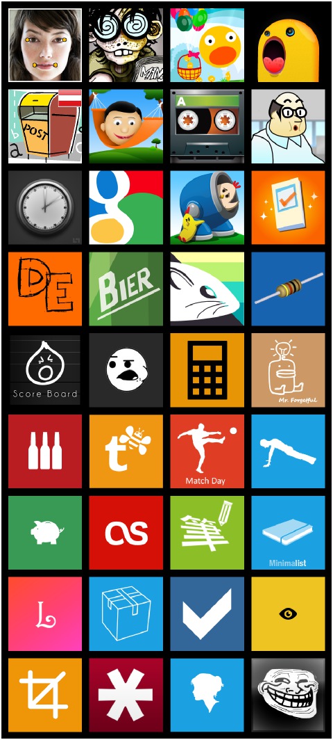
Looking at a lot of the app tiles for WP7, I see a lot of them can easily be improved with this simple tip. To make your app icon look more professional, be sure to add space around your icon’s border. Go from this:

To this:

The first version of the Roman Numerals app icon is just way too cramped. And really, the focus is the huge black space in the middle of the picture. The second version might seem small at first, but the negative space around the icon makes it feel more balanced. It presents the icon in a better fashion since it is correctly framed. Compared with the first, this version just feels more professional.
Here’s another example with Paper Toss before:

And after:

If you look at the built-in apps, like IE or Outlook, they make proper use of negative space around the icons. In general, liberal use of negative space conveys elegance and sophistication. If used properly, it can deliver the message that your app is professional and created with care.
See this great article for an even better explanation of negative space.
